
Pillars Brewery
Location - Walthamstow, London
Year - 2021
Design Credits - Thunderclap
Photo Credits - Thunderclap/Pillars
Explore - Pillars Brewery
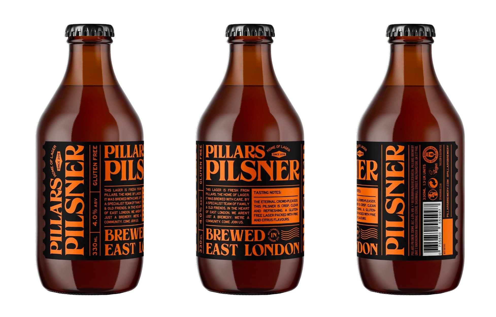
Typographic totems for London’s first craft lager brewery and taproom, Pillars.
Founded by three brothers — Eamonn, Samie, and Omar Razaq and friend Gavin Litton in 2016, Pillars is named after the Reinheitsgebot purity law. Those familiar will know the law dictates the use of only water, barley, hops, and yeast in the production of beer.
Having been established five years, the brewery sought a identity refresh from (the now sadly closed) London-based Thunderclap agency.
Retaining the strong, industrial orange and black palette the rest of the look was completely overhauled and a bespoke, bold typeface became the central point to the label look. It’s got a real seventies feel to it and I’m completely here for it! I really like the heavy reliance on the typography and also the more subtle elements such as the distinctive serrated label edges. And so unusual to see bottled beers nowadays, with the ubiquitous can the smallpack of choice for breweries. Even in this respect, the stubby 330mls and long-necked small batch bottle shapes are a refreshing alternative from the more standard bottles out there.
Continues below


More recently the brewery has incorporated some patterning and additonal colours to the palette for some of their newer beers, and although personally I prefer the pure orange and black look of their core range it’s understandable that this needs to be stretched at some point to allow for a broader range output. There’s only so many combinations of two colours you can employ! These newer beers are very obviously Pillars though and considering the brand is approaching two years established, still looking fresh.


Thanks to Pillars Brewery and Thunderclap for the images featured in this blog piece.